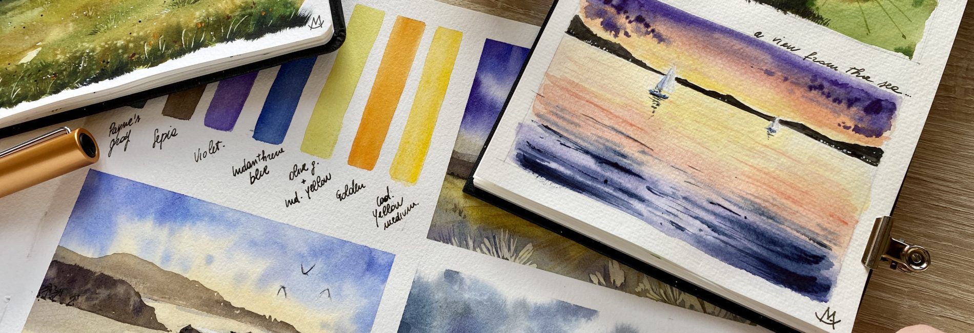
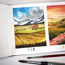
A good composition is one of many ways to improve your landscapes.
The composition is the arrangement and the organization of elements in a space. Whether it’s a canvas, a piece of paper or the screen of your phone when you take a picture, you can learn how and where to place the elements on it. When you create a good composition, you drive the eyes of the observer though your painting, taking him on the road to read your artwork. You make him aware of the most important elements and the way he/she can understand your work of art. All the other elements should just be of support to your main focus, and help you balance the result.
But.. How can I find an interesting composition?
Between the others to create a pleasant composition you might follow the Rule of Thirds. Divide the surface into nine rectangles using two vertical and two horizontal lines, trying to split the height and the width of the area into equal parts. Your focal subject is better placed in one of the four intersections your lines just created (and generally i put no more than one or two elements).
In the end, it’s all about seeing and understanding how the elements in your painting relate to each other and if they are balanced.
If you want to know more about this kind of informations or you just want to grow your skills, I explained many of them in my online class “5 Ways to Improve your Watercolor Landscape” on Skillshare. In this lesson I share with you some useful tips and tricks i use everyday in my works: you can practice them and step up all your paintings.
If you enroll, you will also find a useful resource image (to download and print if you wish) that summarizes all the tips so you can give it a look every time you start a new landscape!

